Creative Elements 2.5.10 : Introducing Product Miniature Builder and Dynamic Tags
Creative Elements 2.5.10 introduces powerful new features designed to give you more flexibility, consistency, and control when building your PrestaShop store. With the Product Miniature Builder, Dynamic Tags, and multiple improvements across product pages and headers, this update significantly expands what you can achieve with Creative Elements.
Product Miniature Builder
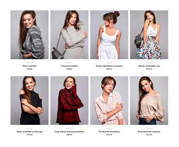
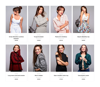
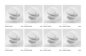
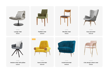
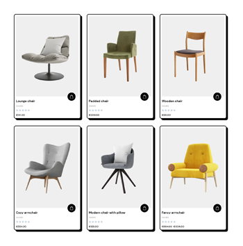
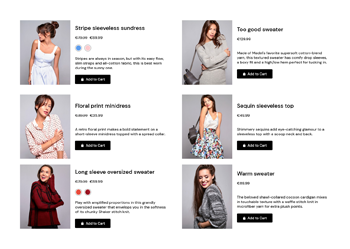
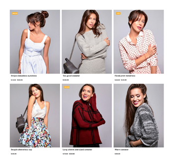
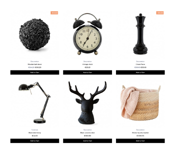
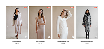
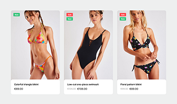
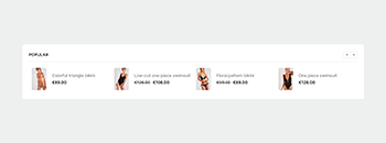
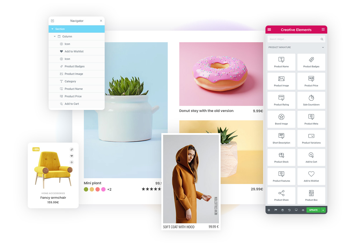
Meet one of the most important additions to Creative Elements: the fully customizable Product Miniature Builder (also known as the Loop Builder).
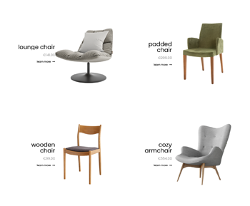
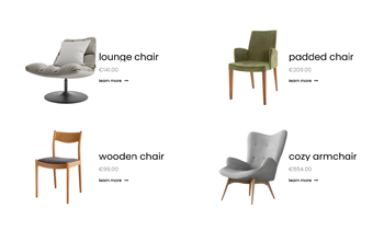
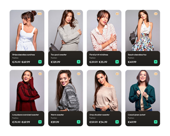
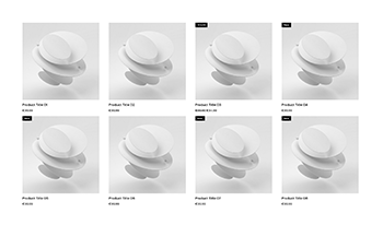
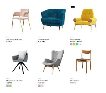
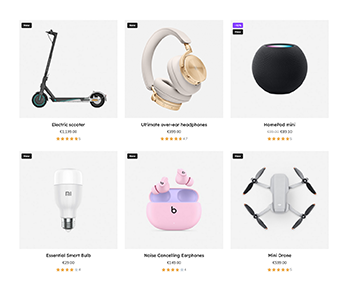
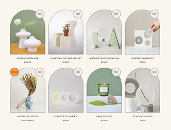
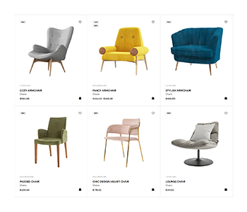
Product miniatures are essential elements of any ecommerce store. They appear across category pages, product listings, brand pages, search results, and carousels. With this new builder, you can now design your own product cards using a wide range of widgets, instead of relying on default layouts.
Dynamic Tags
Creative Elements already includes dynamic widgets such as Product Boxes, Product Carousels, and Product Grids. With Dynamic Tags, you can now bring dynamic functionality into previously static widgets. This feature allows you to dynamically insert content or trigger actions, significantly expanding your design possibilities.
Dynamic Tags can be divided into two groups: one for displaying dynamic content (such as images or text) and the other one for performing an action.
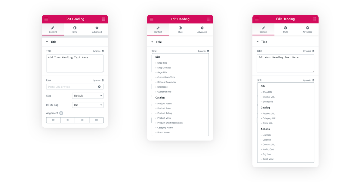
Let's look at some simple examples:
You can set an add-to-cart action on a Button widget or just simply open a lightbox.
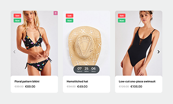
Or create custom navigation for product carousels using Icon widgets — the system automatically detects and controls the nearest carousel. In the example you see below, two Icon widgets are used for navigation events (left and right).
Product Page improvements
This update introduces several improvements to enhance both usability and design on product pages.
The product lightbox now supports zoom functionality, allowing users to zoom in using touch gestures on mobile or double-click on desktop. You can also display an image counter to indicate how many images are available for each product.
In the Product Image widget, zoom on hover is now available, offering a more interactive browsing experience.
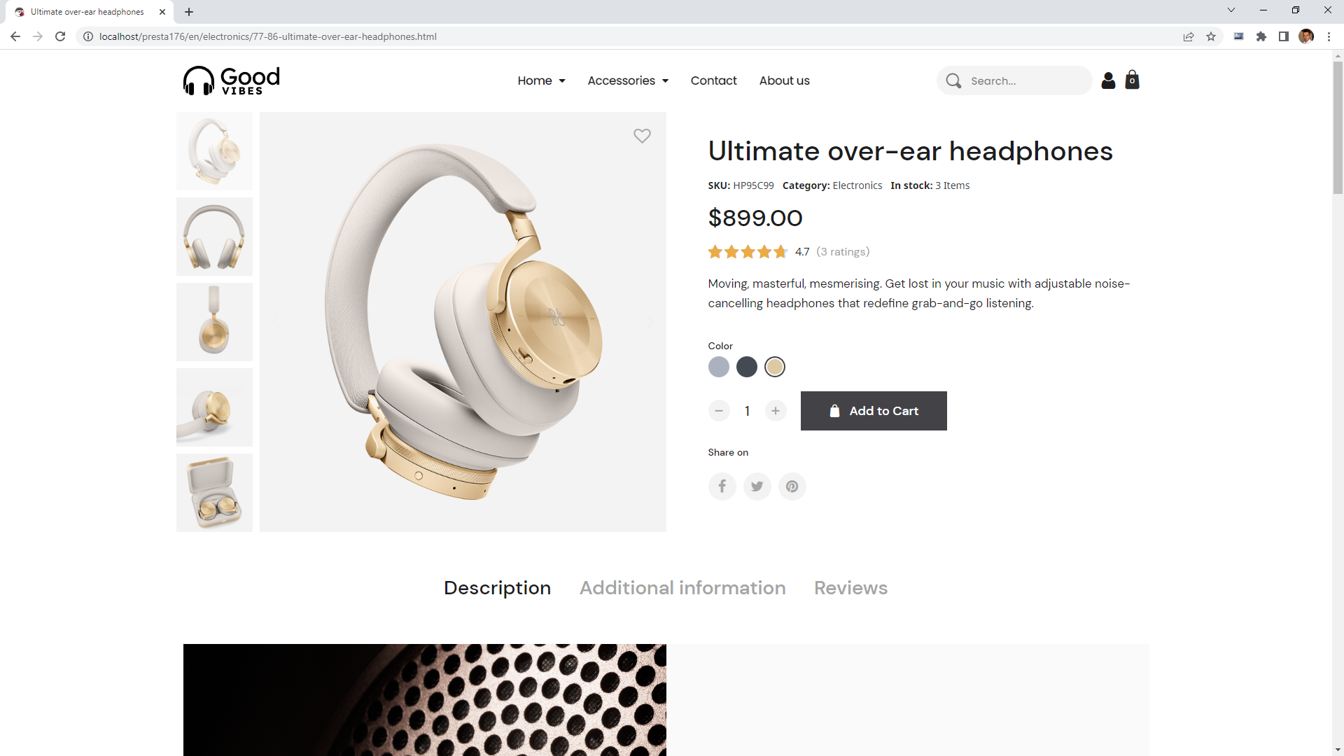
Additionally, widget width can now be calculated dynamically using the calc() function. This allows you to create more advanced layouts—for example, placing a quantity field, an Add to Cart button, and a Wishlist icon on a single row by defining widths like calc(100% - 70px - 40px).
Header improvements
The header is one of the most space-sensitive areas of any webshop. To improve usability, the Sticky Position feature has been enhanced: the header now hides on scroll down and reappears when scrolling up.
Combined with the new width calculation capabilities, this allows for better layout control and space optimization—especially for navigation menus.
You can also reorder widgets depending on the device, helping reduce DOM size and improve loading performance.

Hover transform reworked
Originally introduced for Product Miniatures, the hover transform feature has been expanded to work across multiple widgets.
You can now trigger animations and transitions when hovering over a section or column, not just individual elements. Additionally, you can control opacity changes during hover states, allowing you to create more advanced and engaging call-to-action effects.
Your custom product
Your custom product









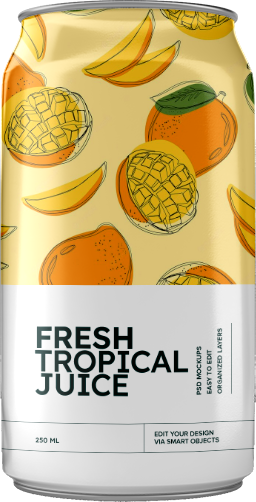
Drink Juice
Stay fresh
Click edit button to change this text. Lorem ipsum dolor sit amet, consectetur adipiscing elit. Ut elit tellus, luctus nec ullamcorper mattis, pulvinar dapibus leo.
WebP Support
Image optimization plays a key role in website performance. Using properly sized and compressed images can significantly improve loading speed.
With Creative Elements 2.5.10, you can now use WebP images in your content. This modern image format provides better compression while maintaining high quality, helping your pages load faster.
We still recommend using optimization tools such as Compressor.io or TinyJPG to get the best results.
Creative Elements 2.5.10 introduces major improvements that enhance both flexibility and performance. With the Product Miniature Builder and Dynamic Tags, you gain full control over how your content is displayed and behaves. Combined with product page enhancements, header improvements, and WebP support, this update helps you build more efficient and engaging ecommerce experiences.
How to Update?
Creative Elements v2.5.10 is available now. You can update directly via your module manager to take advantage of these new features immediately. The update process handles everything automatically, so you can get back to building straight away.
Build smarter. Design freely. Optimize your store.
Explore More Updates
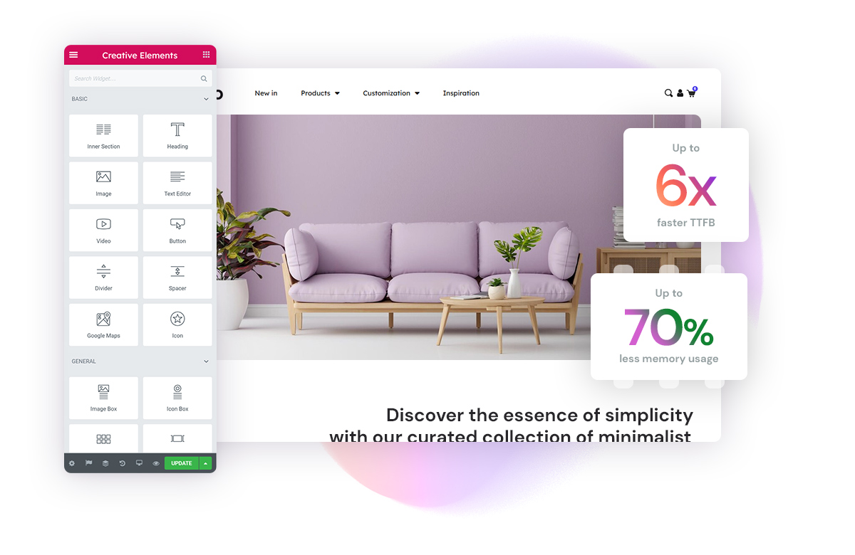
Creative Elements 2.11 : Breakthrough Speed and Performance Enhancements
In the fast-paced world of online retail, every second counts. Introducing Creative Elements 2.11, o…
Read more »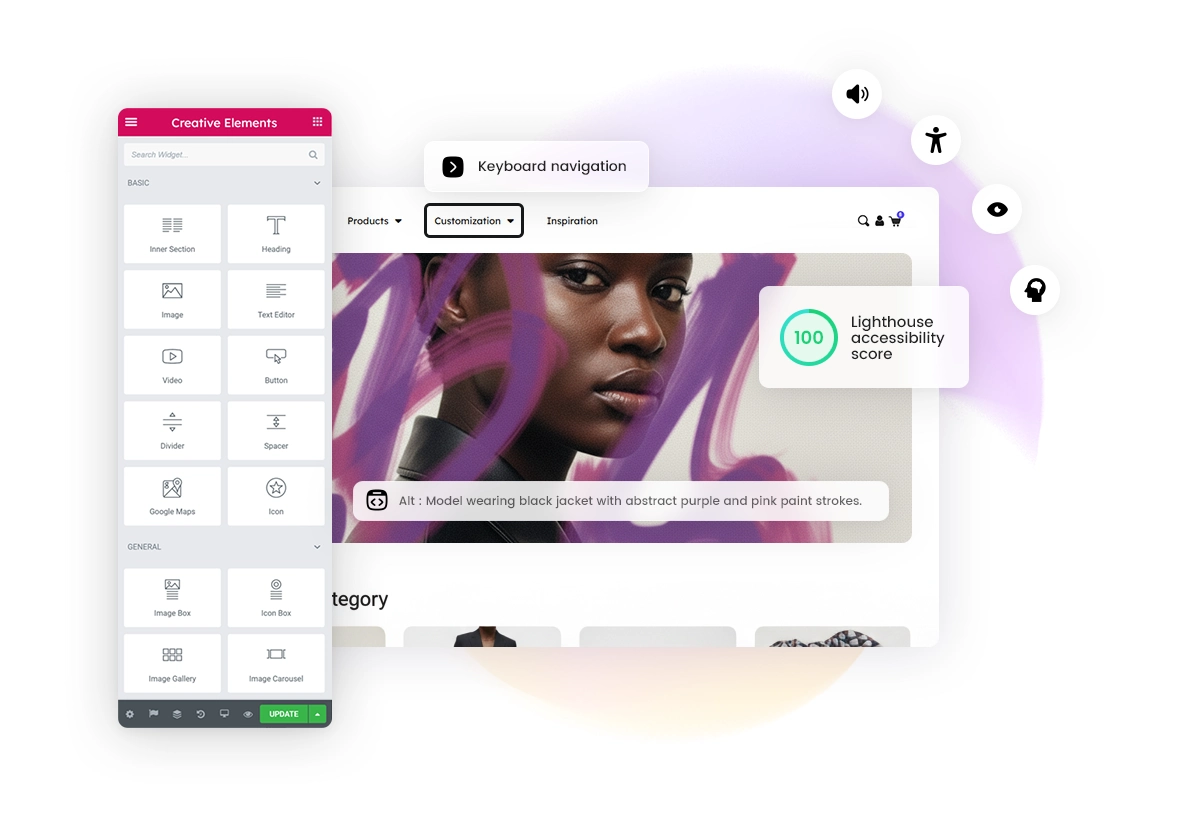
Creative Elements 2.14 : A Giant Leap for Accessibility & Performance
In the rapidly evolving landscape of e-commerce, two factors are currently dominating the conversati…
Read more »
Creative Elements 2.9.14 : Introducing Theme Style and Custom Icons
Creative Elements 2.9.14 introduces powerful new tools to help you design more consistent, modern, a…
Read more »


